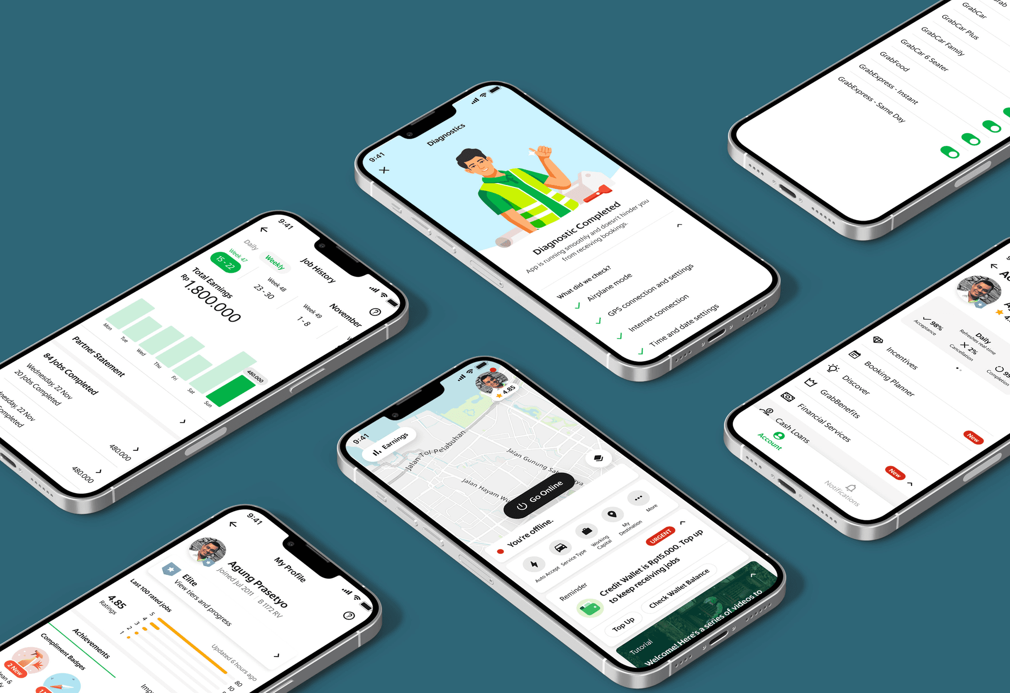
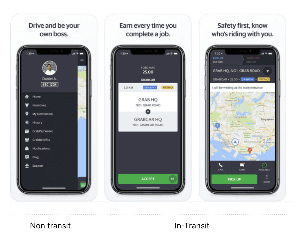
Driver app which drivers used to perform their daily jobs at Grab from dropping passengers, delivering their food, delivering their couriers etc
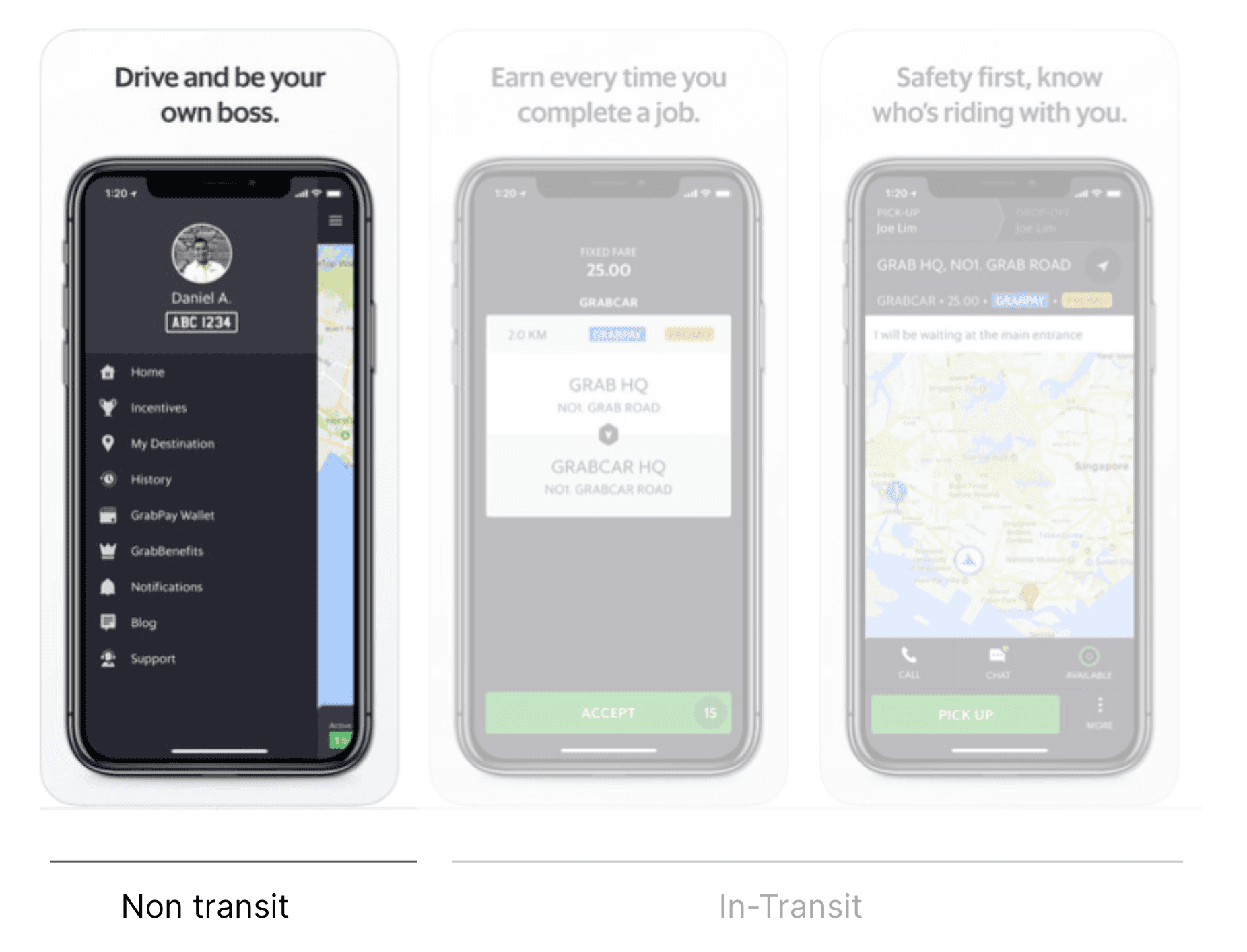
App is divided into 2 parts:
In- Transit : For delivering customers, food, couriers, groceries etc
Non Transit: Rest of the app to enable them (Earnings, incentives, maps, jobs etc)
Introduction
For now lets talk about Non-Transit
My Role
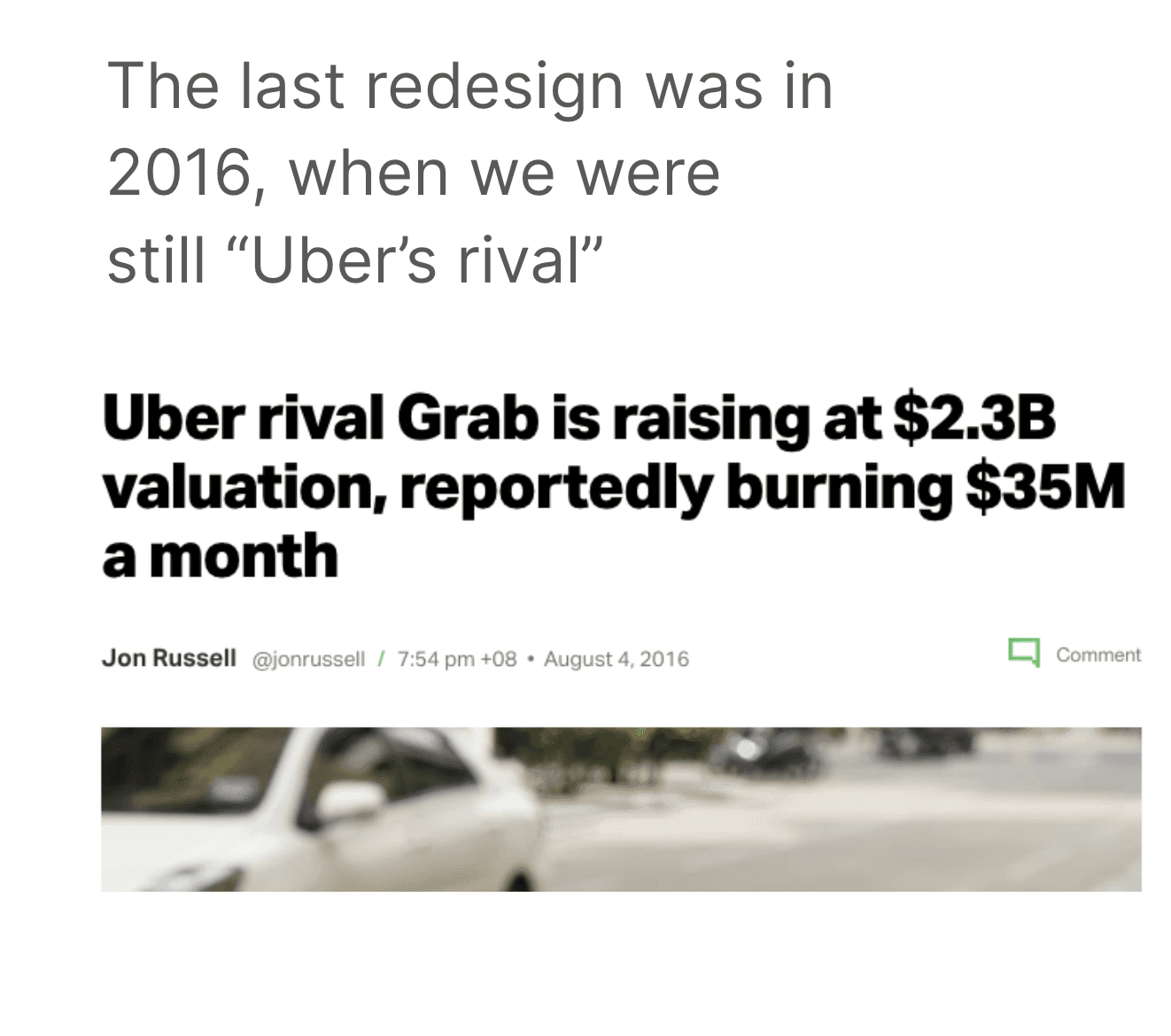
When Grab was much simpler
Last redesign happened in 2016, the current driver app was developed in a world where incentives was a focus, and one type of job: transport. It was also in a world where we only had a few main competitors.
Since then, Grab has scaled to food, express, hitch, financial products, and more, in many markets vs many competitors, making the current app difficult to scale with our pace.
Why Redesign Now?
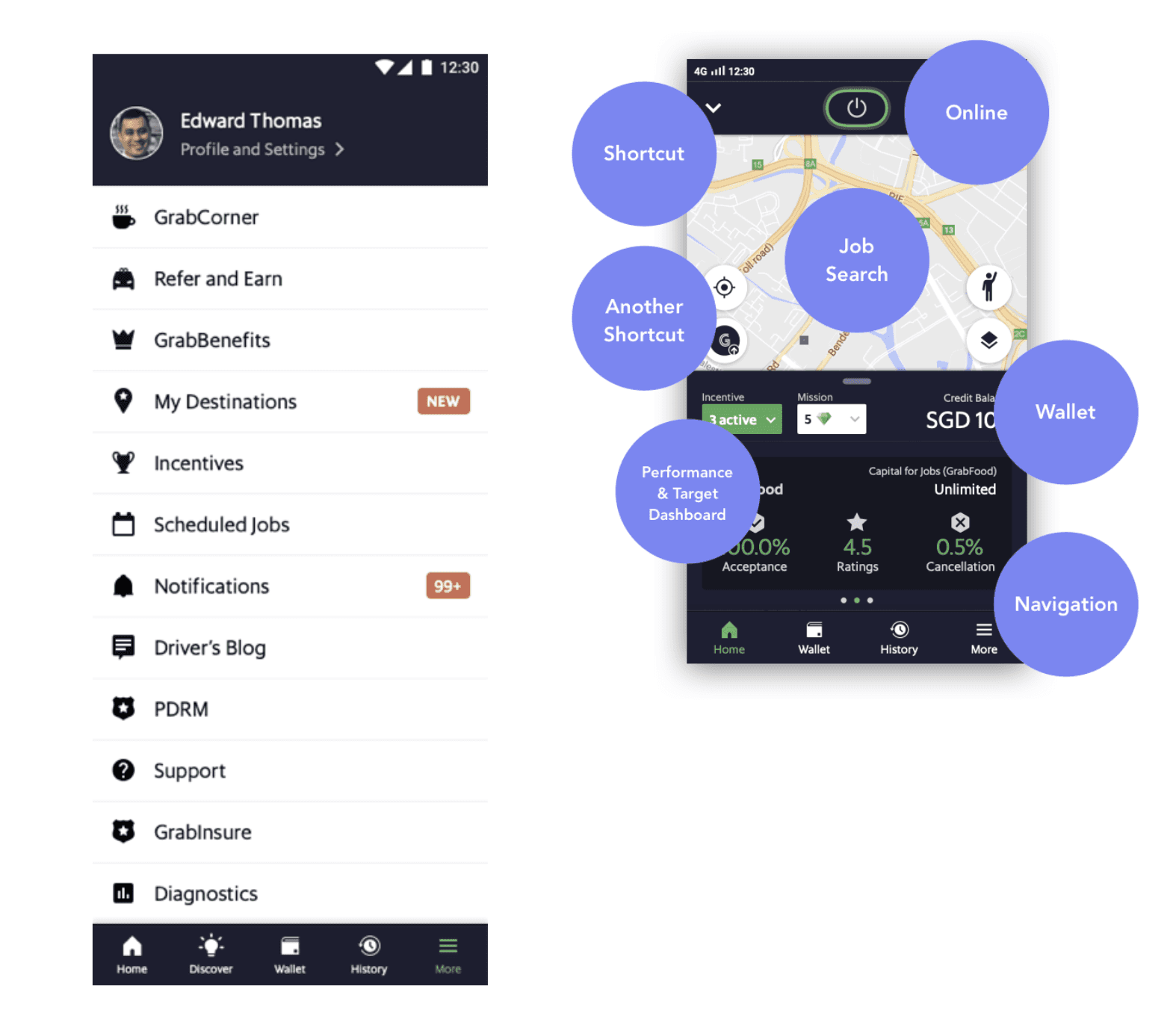
No hierarchy.
Only place to have a visibility on new features.
Inchoate and incoherent structure.
Adding stuff one after another
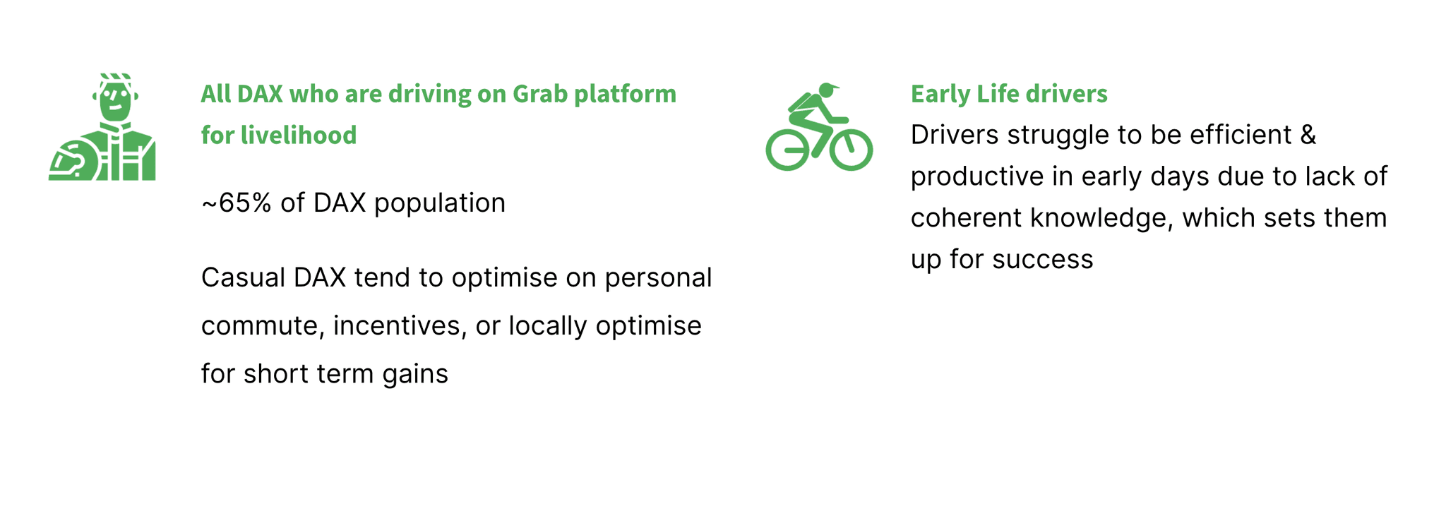
Grab app is ineffective at surfacing relevant information that helps DAX find jobs, discover new features, and learn how to improve. Grab sent ~60 notifications per day per dax (Q3 2019) with an open rate of 2%.
Target Customer Segments
This causes
Uncertainty, anxiety
Information architecture prevents drivers from intuitively finding the right information at the time they need. As driver quotes: “I don’t know how to to strategize my day”
Complex experience, blocking adoption
Varied job experiences does not help drivers to adopt the platform as it is not intuitive and is complex to learn. Cancellation increases as app does not know if driver have enough cash to do food job. Drivers get suspended as there is no place to update document
Poor cross-sell discoverability and Learning
Non-scaleable information architecture leads to poor discovery and understanding of product offerings and features.
As driver says “Many of the features don't come with tutorial and tough to navigate through”
Aging infrastructure
New product development takes a long time to think through corner cases with old app infrastructure
Infrastructure to have dax-pax handshake will take 4 months to build
“Platform fee took over a month just to add two lines in receipts… so painful”
Can not update document from app as our document service is not upto date.
A fundamental redesign will enable us to design elements and components that scale well with new verticals, new products, ever changing needs, and support Grab’s evolution as an everyday and everything app
Long wait between jobs
“As a driver, there could be long periods where I don’t get a job, making me think the app isn't working. How come my friends are getting jobs and i'm not?”
Lack of help from Grab
“As a driver, if I did not have my friends, I would not have survived as a driver”
Difficult to discover and consume information
“As a driver, I get overwhelmed with the amount of information that Grab sends me and it's hard to find the right information”.
Within the driver app, I want to know what matters the most to the drivers, so I can strategize better.I am not aware of many features in the app and don’t know how it works.I want Grab to support me to do my job better.
Adaptability to frequent changes
“As a driver, the app changes every month and this causes me a lot of problems. I feel things are changing too fast for me.”
Objective
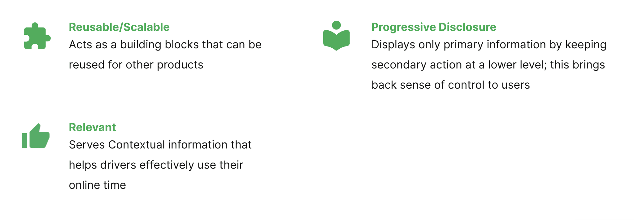

Create experiences people love and use every day. By this redesigning we want to give drivers an experience that is
What metric and business outcomes are we driving
“A fundamental redesign will enable us to design elements and components that scale well with new verticals, new products, ever changing needs, and support Grab’s evolution as an everyday and everything app”
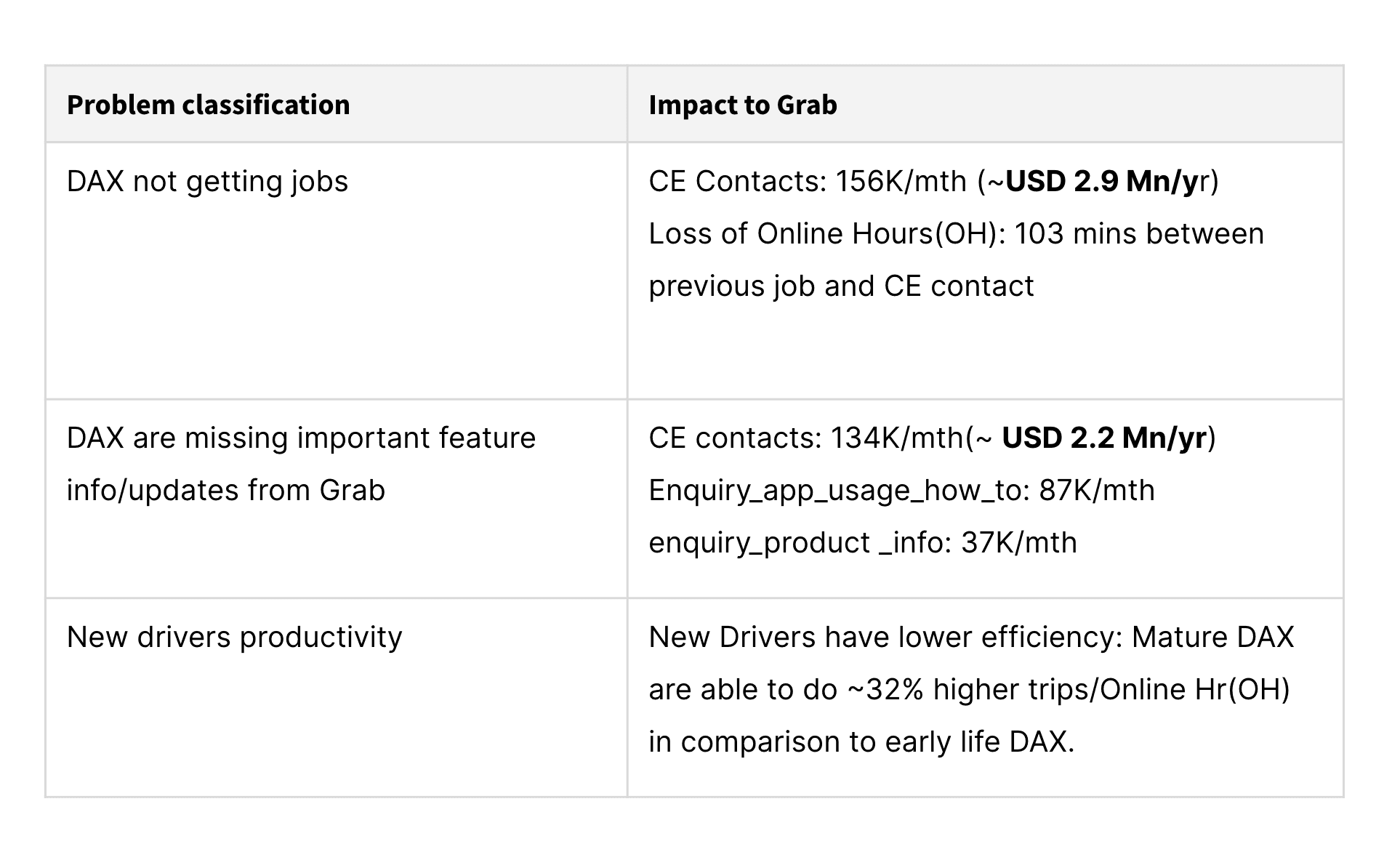
Findings
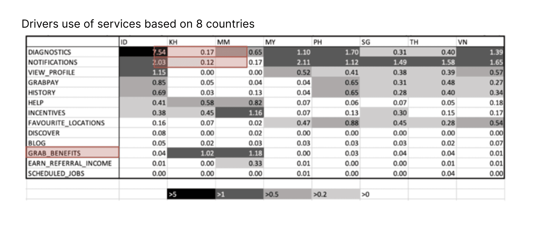
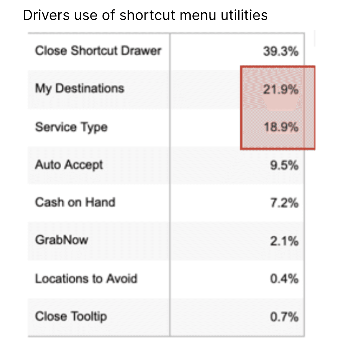
Finding Results
Things driver check and use a lot
Shortcut menu on home
Earnings and Incentive
Notifications
Profile
Explorations
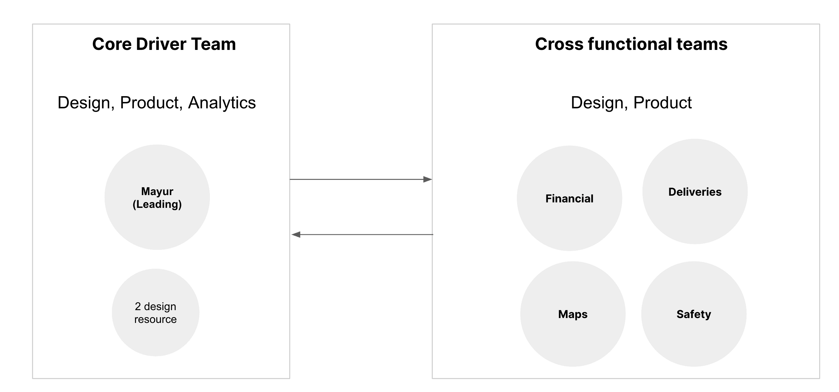
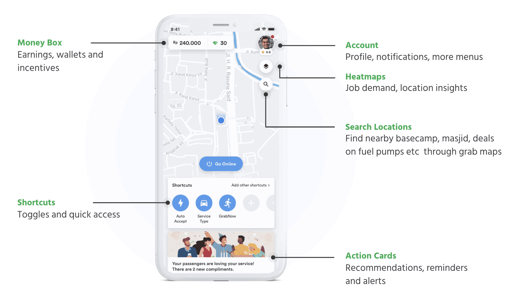
Based on findings we created a mental model for drivers and broke home page into 4 parts
After iterating from option 1. We came up with a feed like structure where things are placed across map based on usage.
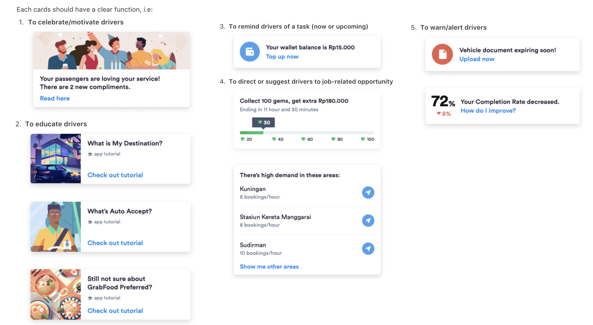
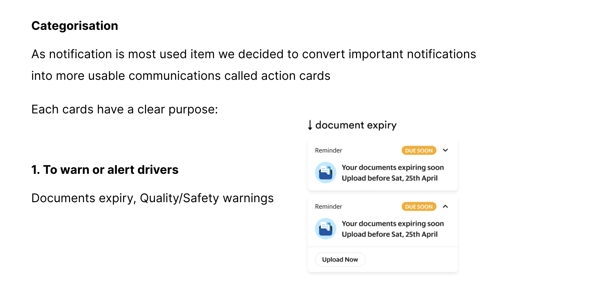
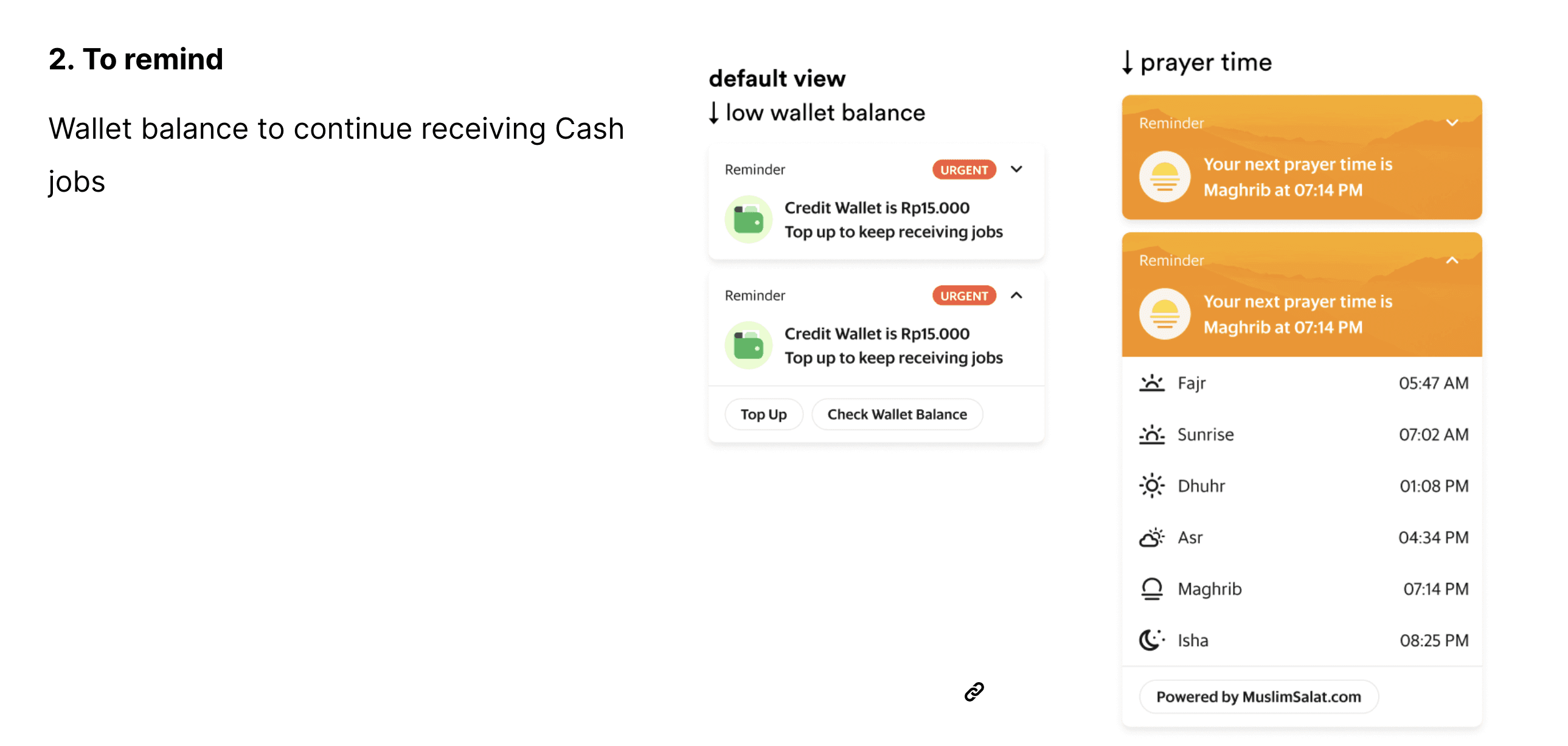
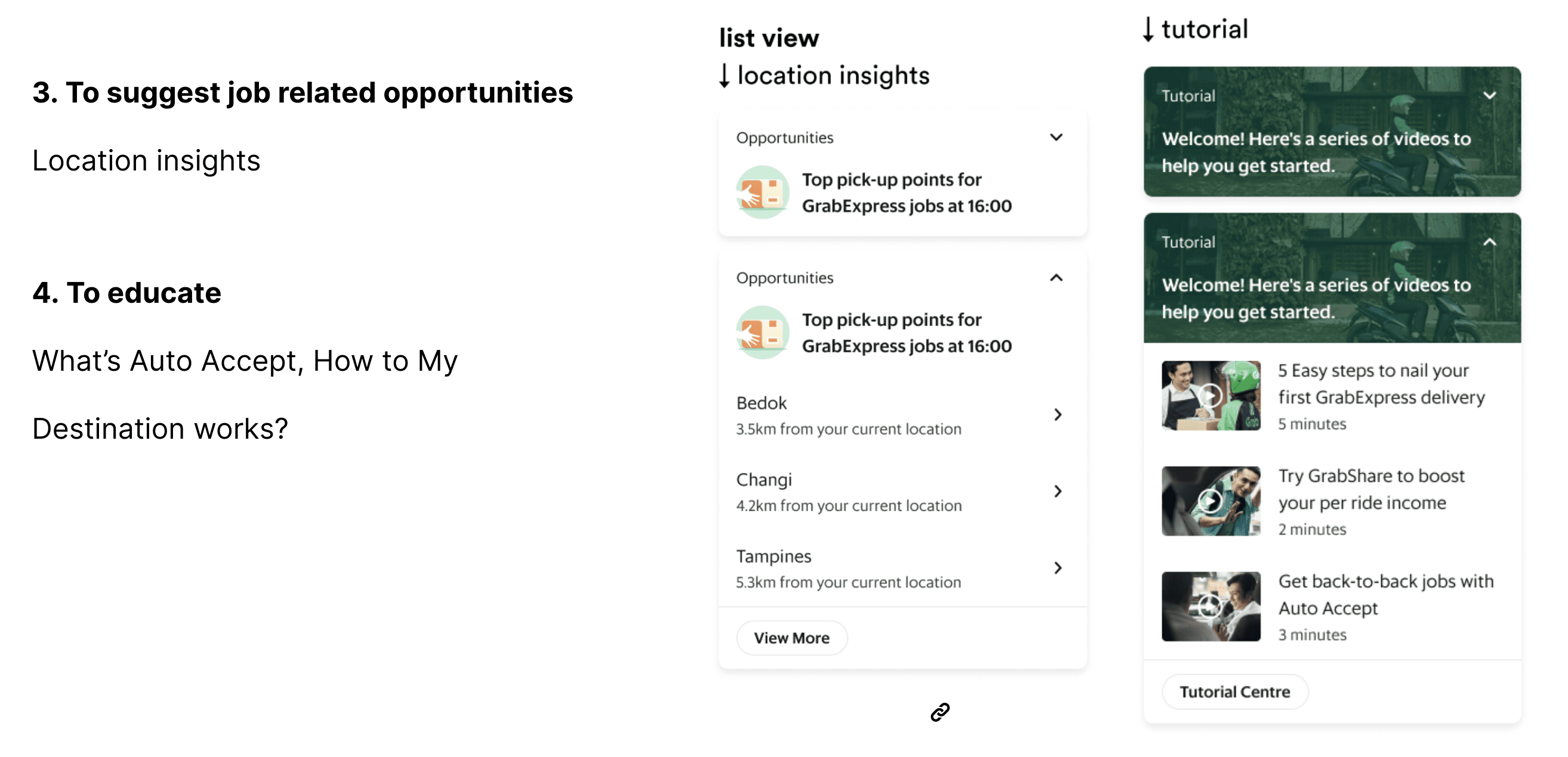
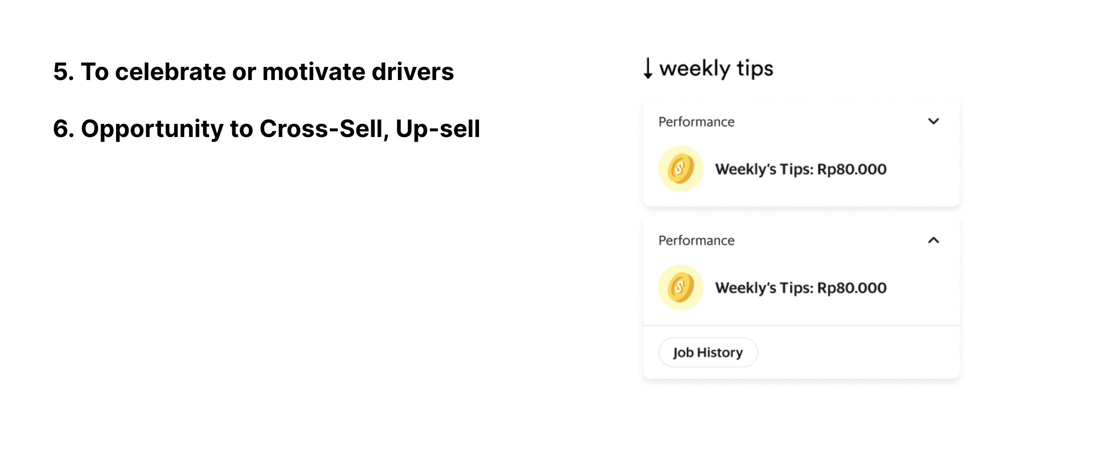
Action cards
“ As a driver, I’d like to be informed, reminded or alerted about useful on-the-road information.”
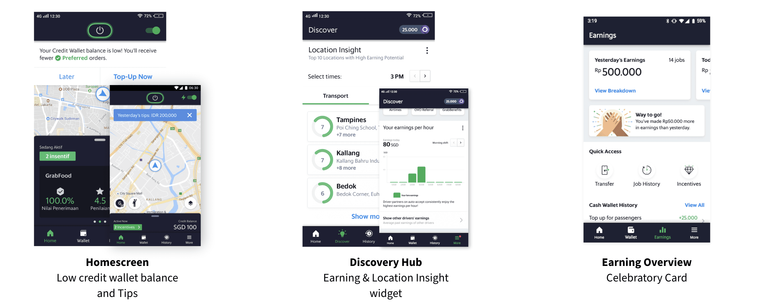
We have worked on action card which is collection of all the communications across apps on to a one place at home page. This helps driver strategize their day and not miss important information
Customizable shortcuts of home page
“ As a driver, I’d like to quickly access or toggles my most used tools or actions.”
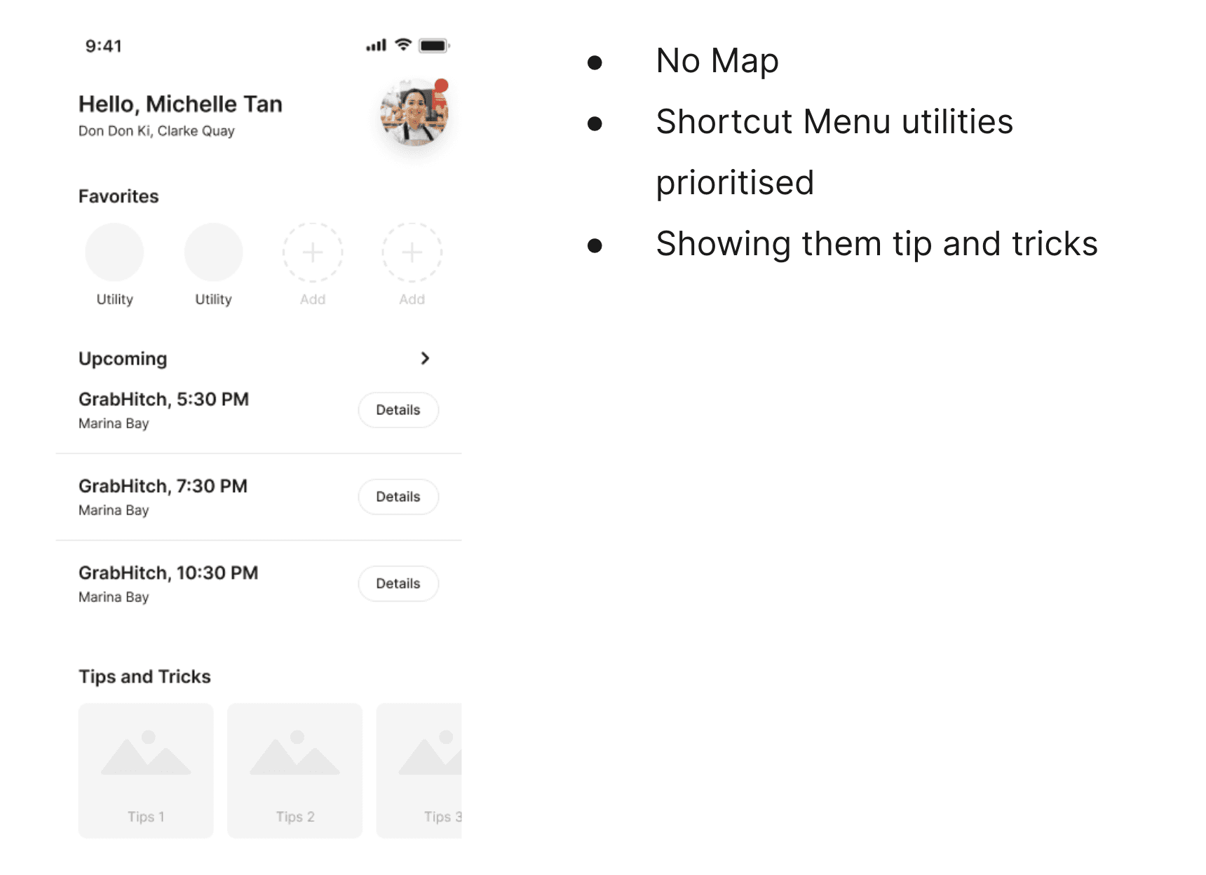
In this iteration we explored a version where we can let go of map on home page as they mainly use map for their jobs.
But as we discussed with our crodd team this limit us in future possible map based features such as treasure map
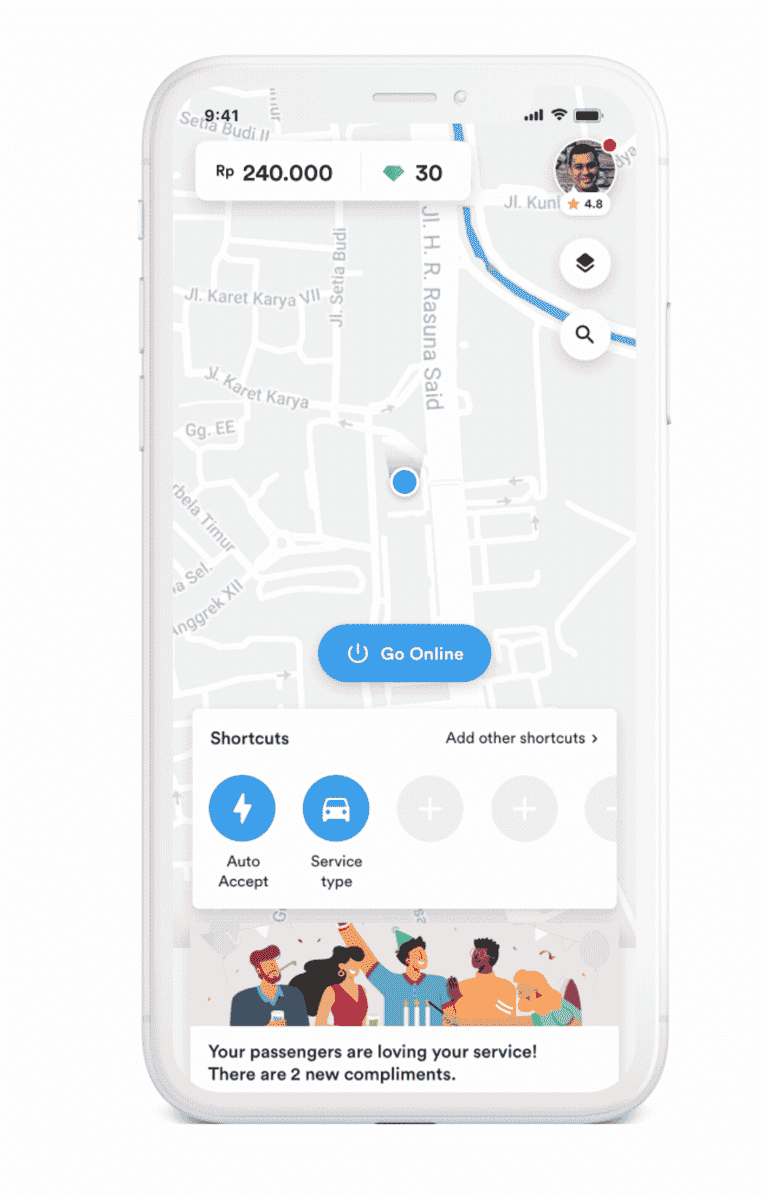
Iteration 1
Iteration 2
As a driver for me home page is for
How I perform
Where I should go
How to do my job
and what’s next for me.
Usabiity Testing
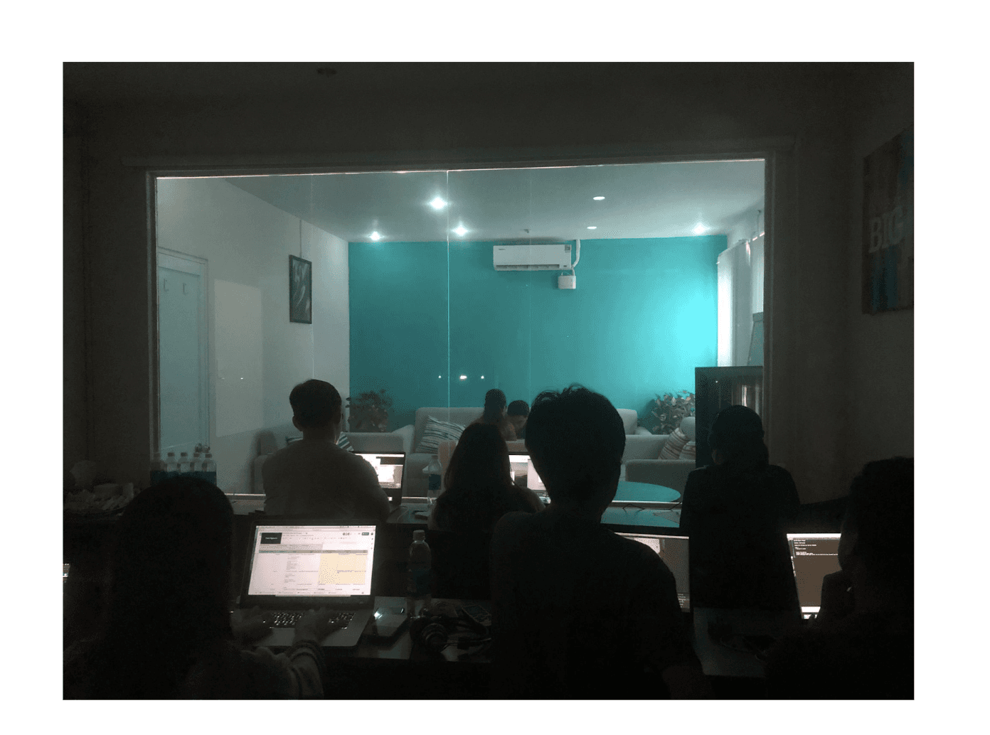
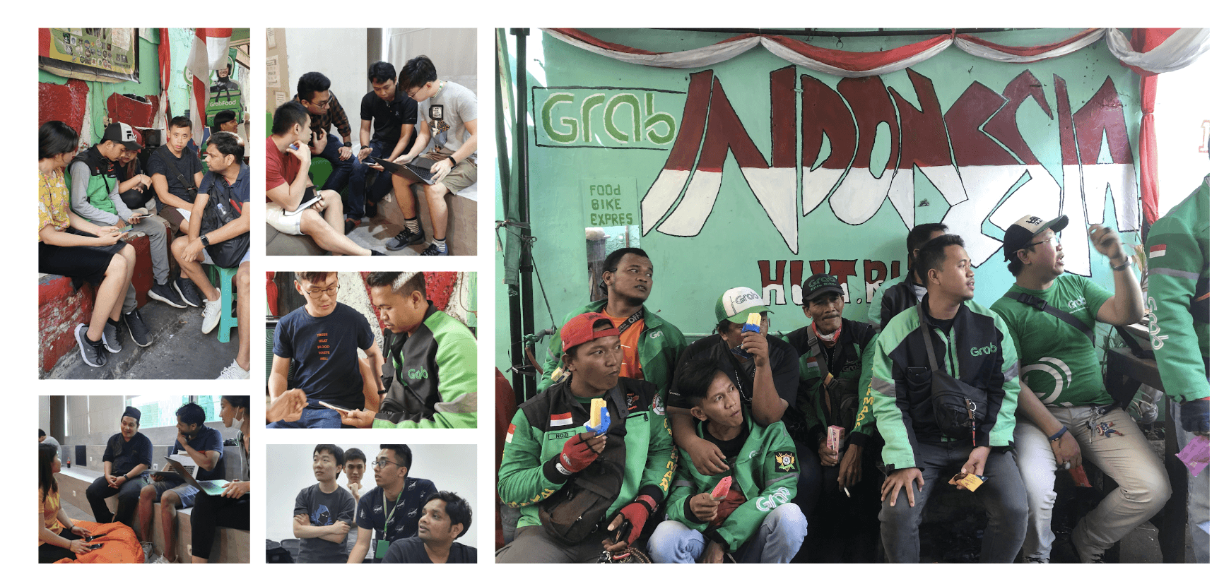
Gurreila and Formal UTs were performed in Indonesia, Vietnam and Singapore with engineers, content writers, product managers and moderators.
Drivers reaction: It’s a new app but does not feel like new, which was good as they dont feel it has been changed drastically
Earlier in app only source of brightness was map part but new app look bright and light
I can quickly see my earning and gems in one glance (Singapore)
I don’t want my customers to see my earnings (VN, ID)
I can see my ratings upfront
Drivers interact with feed and reaction was this is related to notification but in more arranged manner
I don’t need to click on shortcut drawer and can use utility upfront
They know they are online and will receive jobs which was not case previously.
I can learn about features and like onboarding of new app
It also tell me where to go for job
Shortcuts do not work as drivers do not understand idea of adding and deleting menu items.
Notification is stuck in between in tile layout which needs it seperate space
Drivers like tile layout in more page but they need to click more to view other options
Drivers are not able to understand why we have coloured icons is that adding any value
Drivers are asking why wallet balance is removed from home page
Drivers interact with feed but not with all cards.
The Good
2nd UT
Things which can be improved on
Based on one more usability testing we iterated our designs
Designs
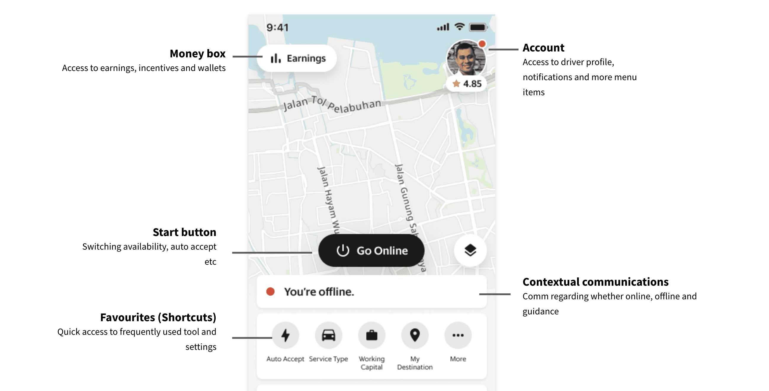
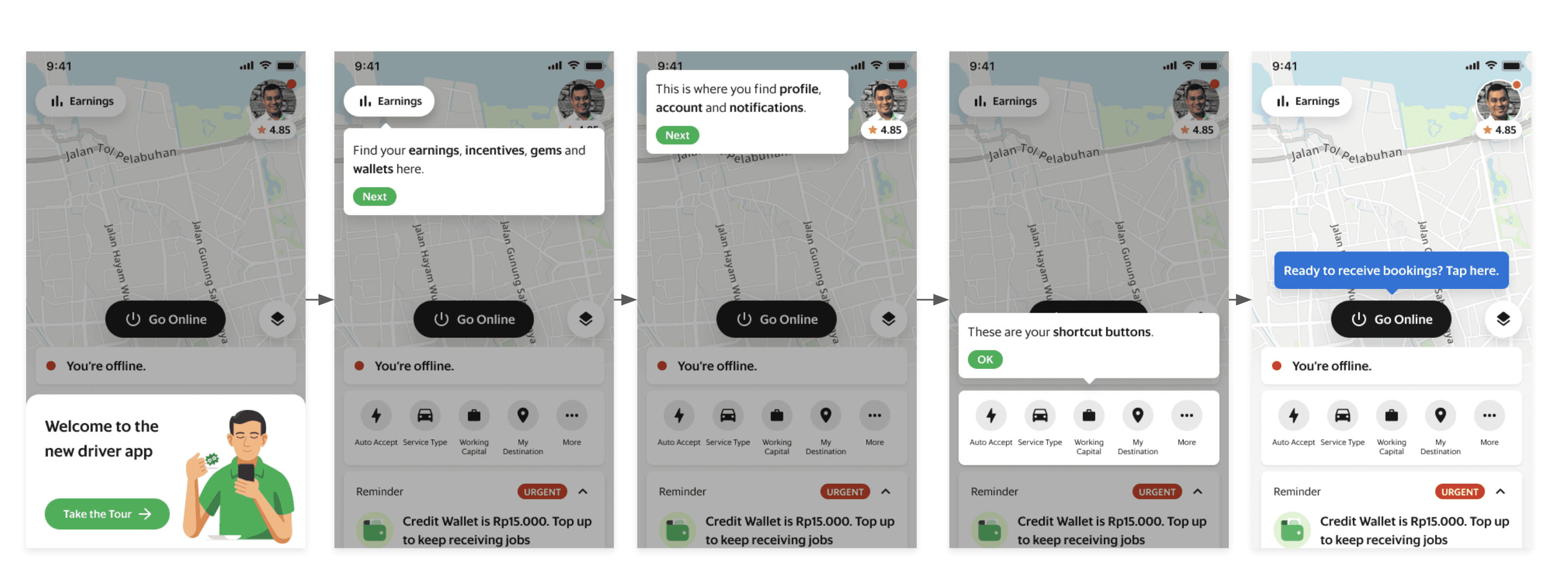
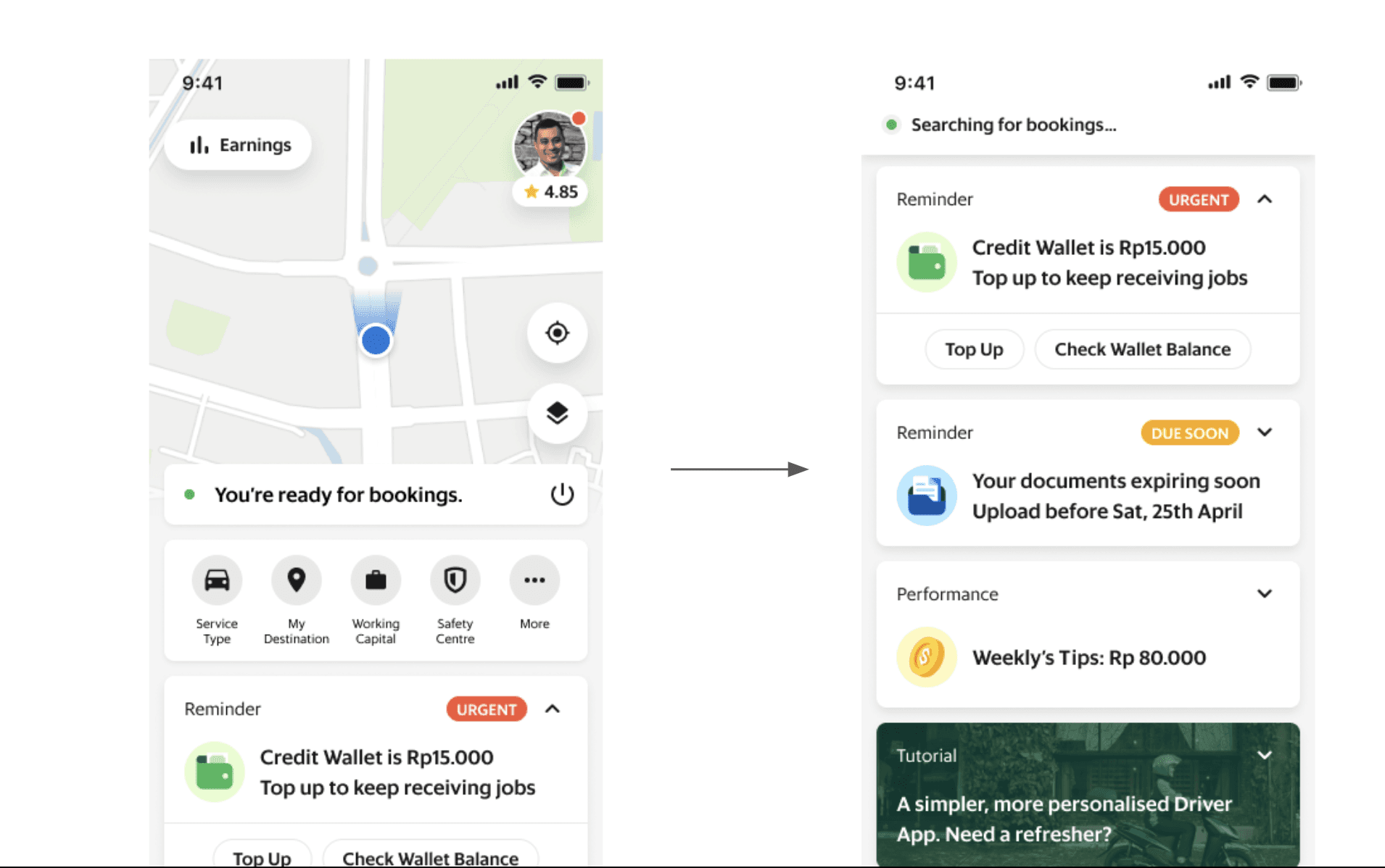
Major improvements from past iteration
Earning is hidden
Removed the customisation of shortcut menus but will priortise them based on user usage
Actions cards also changed to more consisten designs
Home Page
Solution to efficiently convey information to a driver partner in form of action feed cards.
What is an action card?
Action cards are set of recommendations, reminders or alerts contained within a card component which aim to provide personalised information
Why use an action card?
We designed action cards to live by principle of progressive disclosure. Progressive disclosure is proven beneficial in maintaining the focus of a user’s attention by reducing clutter, confusion and cognitive overload. It improves usability components: learnability, efficiency of use and error rate
Who are action cards catered to?
From early to advanced drivers; both spectrums benefit from these cards.
For early joiners, actions cards helps prioritise their attention so that they spend time only on information that are most likely to be useful to them.
For advances drivers, actions cards saves them time because they avoid having to scan past a large list of information they would rather process later on.
Where do actions cards live?
Home screen and in-transit
How to use action cards?
There are 2 sets of users: Drivers and Grab
To drivers, actions cards main functions are scroll to browse, tap arrow to expand or close, tap button to choose primary action or tap more to choose secondary actions.
To Grab, actions cards will be used for Recommendations/remind/alert/educate/cross-sell.
Lets talk about action cards
How action cards works
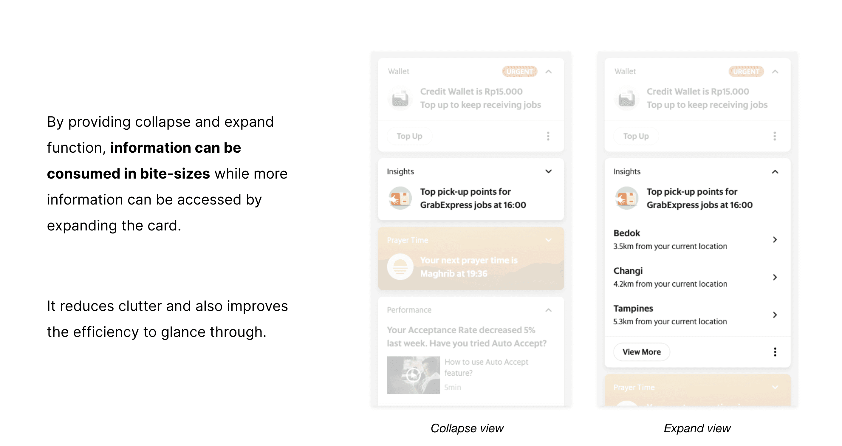
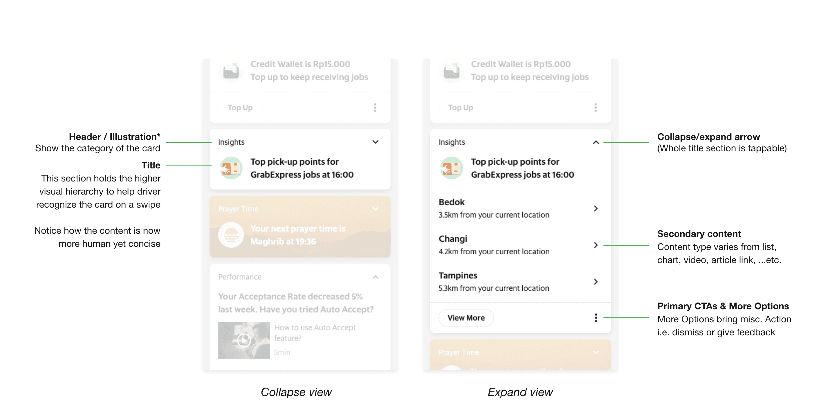
Other Features Overview
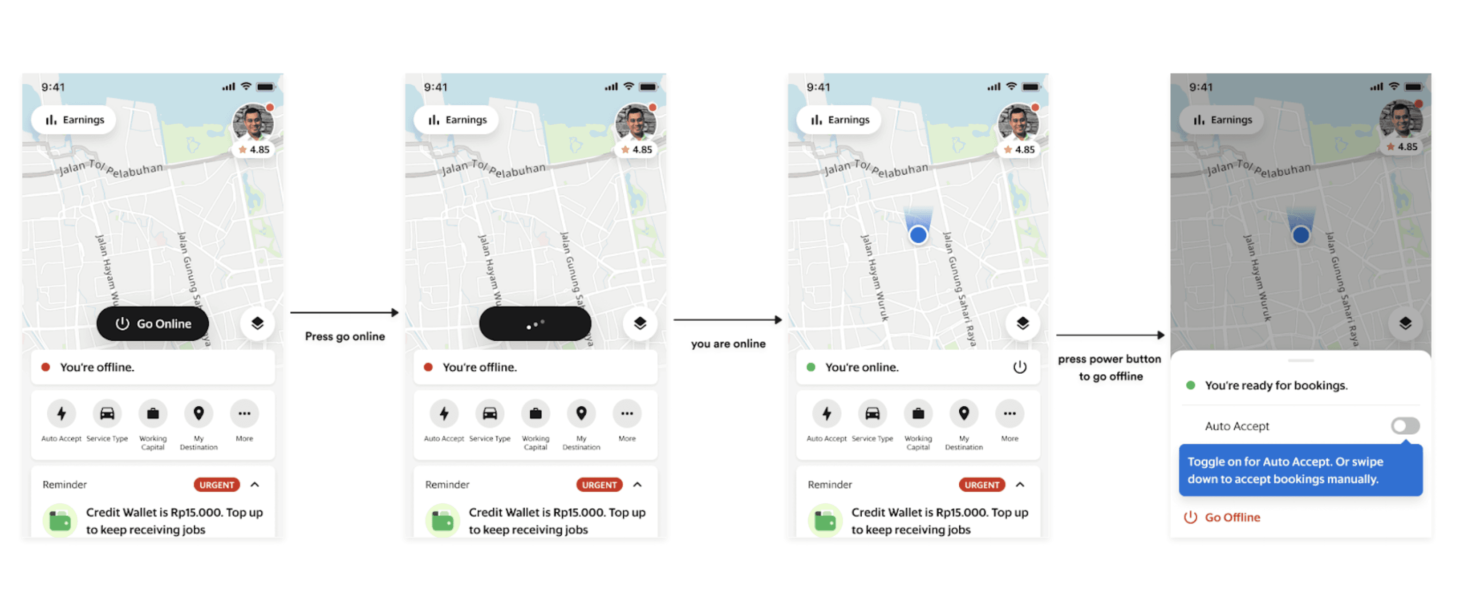
Go Online & Offline
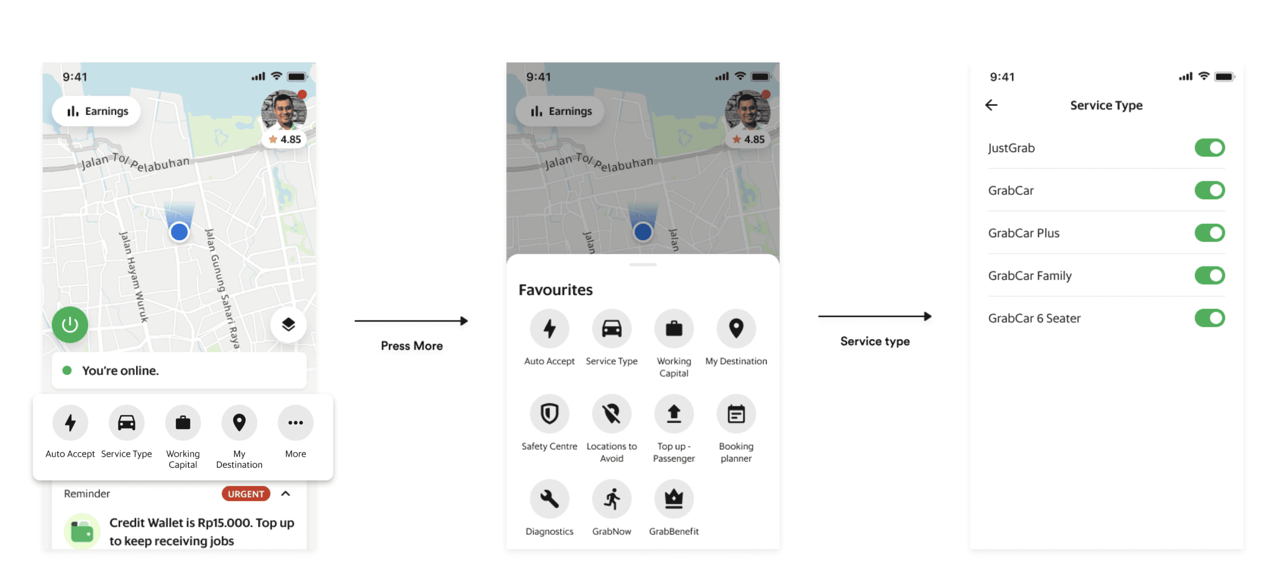
Favourite Utilities
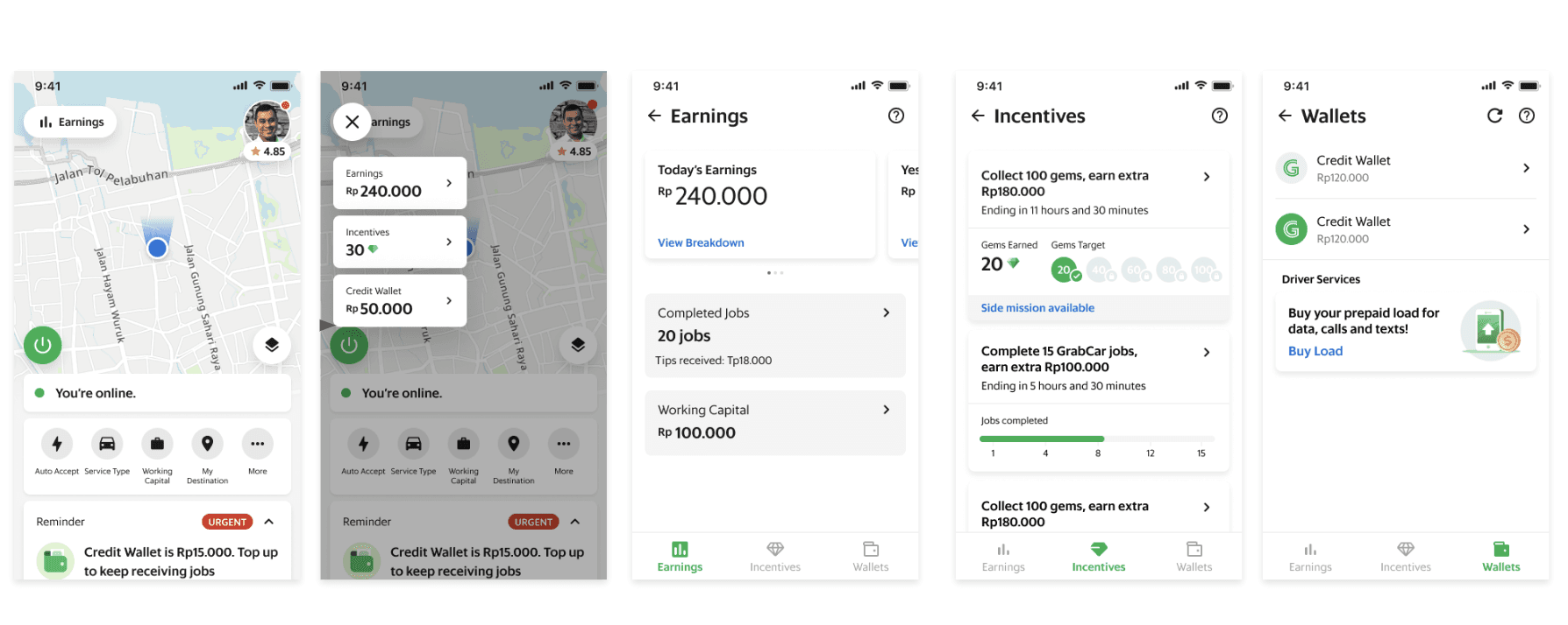
Money Box
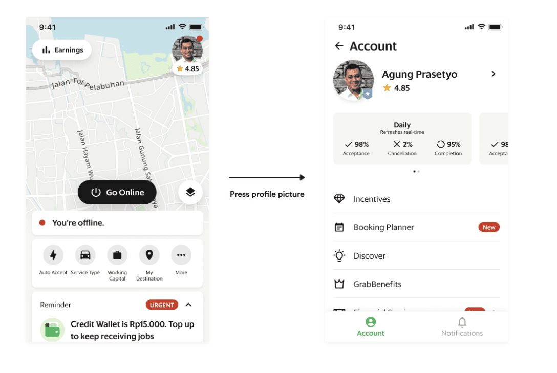
Profile
Impact
CE Contacts: (-) 57K/mth
DSS: (+) 1.5 points
Trips/Online Hour: (+) 0.35%
Trips/OH for new drivers: (+) 5%
Impression + CTR on Action Cards: (+)20% in comparison.
Increase in business relevant CTRs (e.g. Benefits 18.2% --> 25.6%, Help Centre 6.7% --> 20.1%)
Drivers filtering out due to low Cash-on-hand (COH) decreased by upto 50% and cancellations decreased by 2PP.
Decrease in CE tickets for documents by approx 35%
App store ratings increase from 3.9 to 4.3 for android, and for ios 3.5 to 3.7
Biggest Takeaways
Constraints and Challenges
